The (side) Facade Election
/
... and the side facade of the house you see first when you approach the house:

We can't leave it like this.
Everybody agrees.
But everybody has a different opinion about HOW to renovate this part.
The discussion is very lively. This I understand from the Italian emails copied to me...
We have 2 problems:
1) it should not look like a shoe box
2) it should not be too expensive
Here are 3 approaches for the (side) facade:
A)
'The expensive shoe box version'
(repeating the design of the main facade for each floor)

B)
'Mixing old and new elements'
(renovating nicely the stone wall and adding white columns from the main facade)

C)
'The simple version'
(coloured plaster only on the top floor that is the newest part of the house; renovating part of the stone wall to water & wind proof; the lower part remains as it is as it borders to the neighbour's property)

How about voting ?
Are you still in voting mood?
We have 3 candidates: A), B) or C)
Please vote on the top of the blog roll (on the right)
(I am not sure which one is actually preferred by whom).
To support the decision making process for everyone, I post some more pictures around the house:
 House from the garden
 Nicely detailed renovated garden wall
 The other side facade - it was plastered before
 House from seaside (1)
 House from seaside (2) - including side facade in question
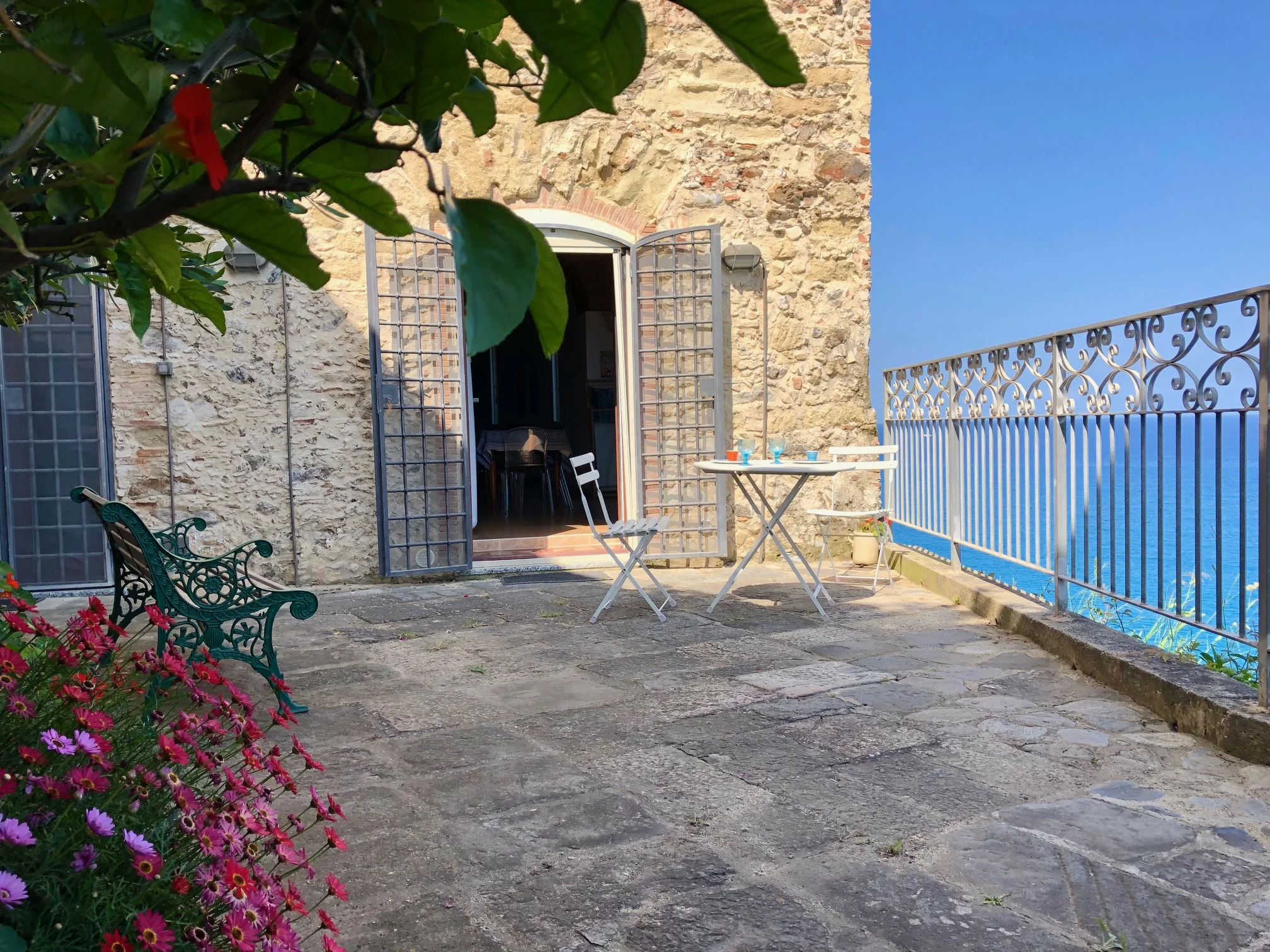
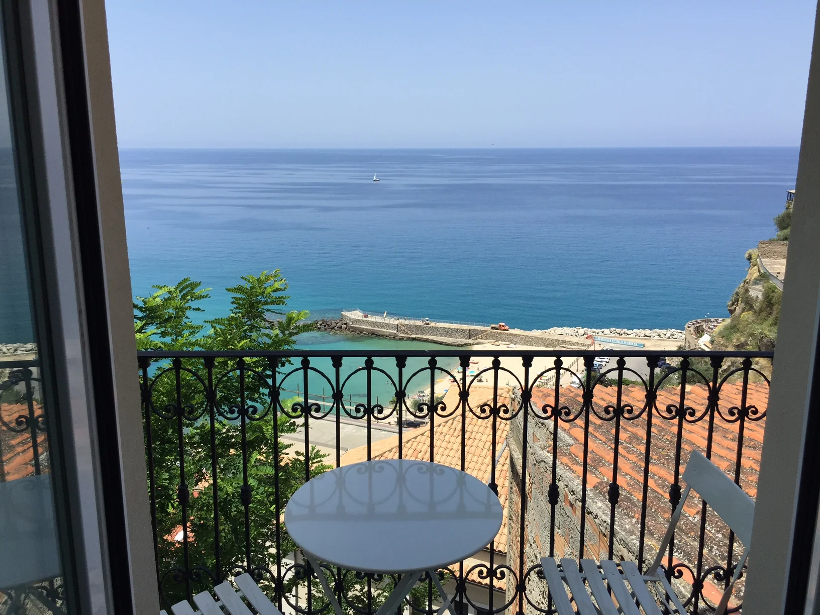
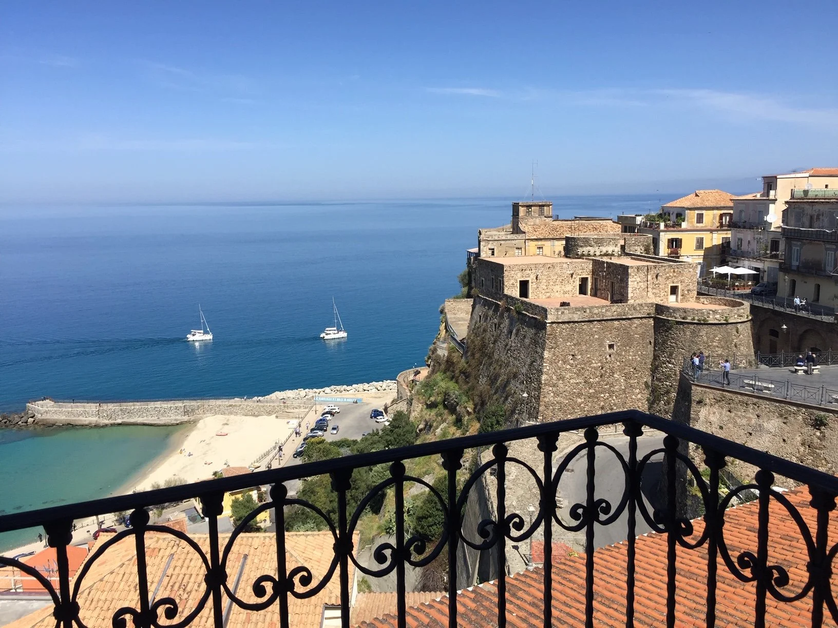
And here some samples from facades in Pizzo:
 Facade sample for the use of mixed medium - stone and plaster (click on photo to enlarge)
 Stone facade partly plastered (click on photo to enlarge)
 Most famous stone wall (from the castello of Pizzo)
Please vote for your favorite solution on the (right) blog roll
A) most detailed (expensive shoe box)
B) mix of old and new elements
c) most simple version
I am curious about the result and about how to use the poll gadget!
Thank you for your support!


