New Drawings
/

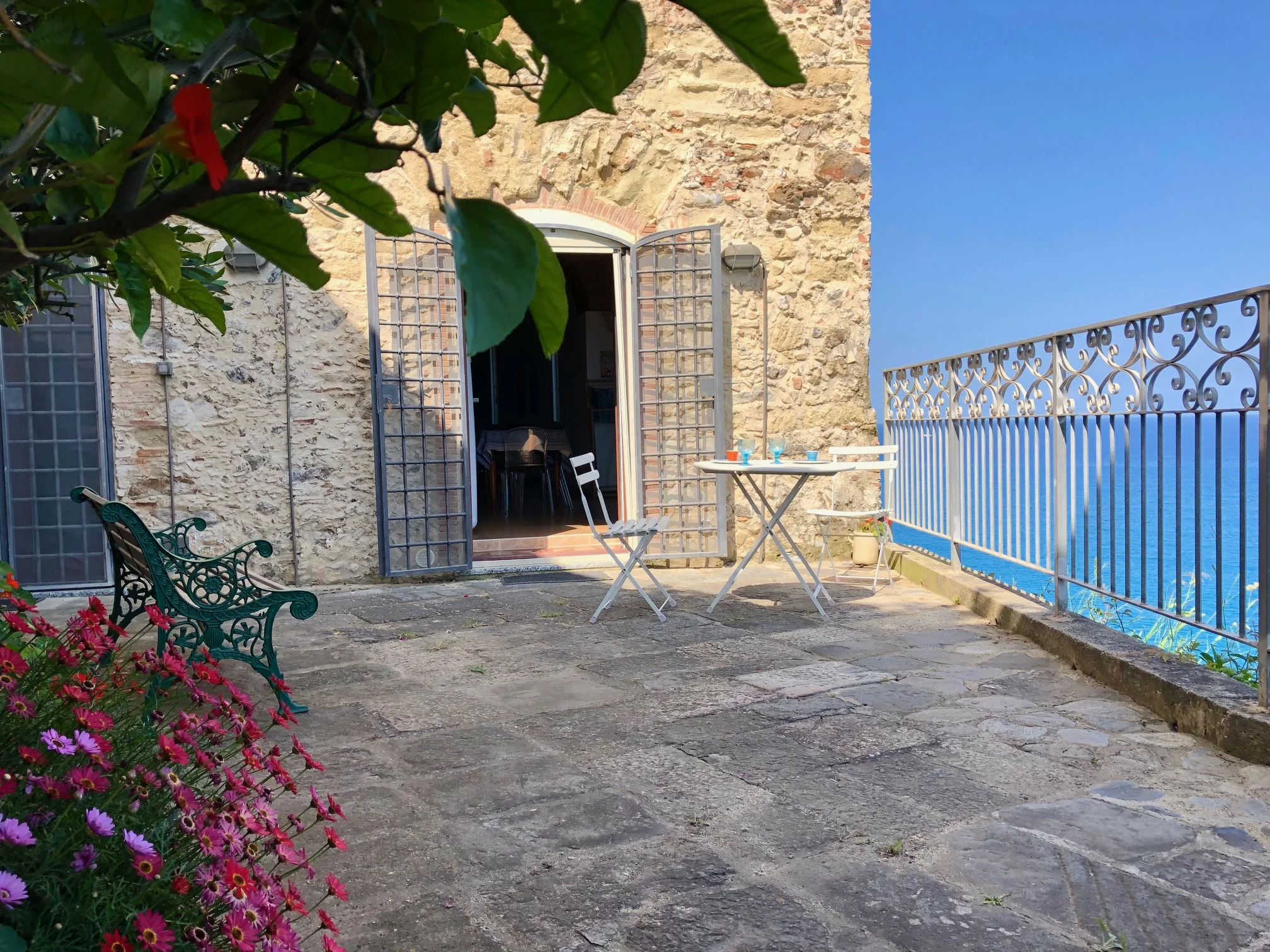
An email from our young and talented Italian architect was forwarded to me. He had sent along two new drawings he had made from the house. One shows the view of the front facade with the main entrance and one shows the view of the house by the see.
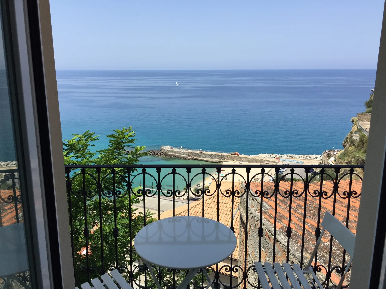
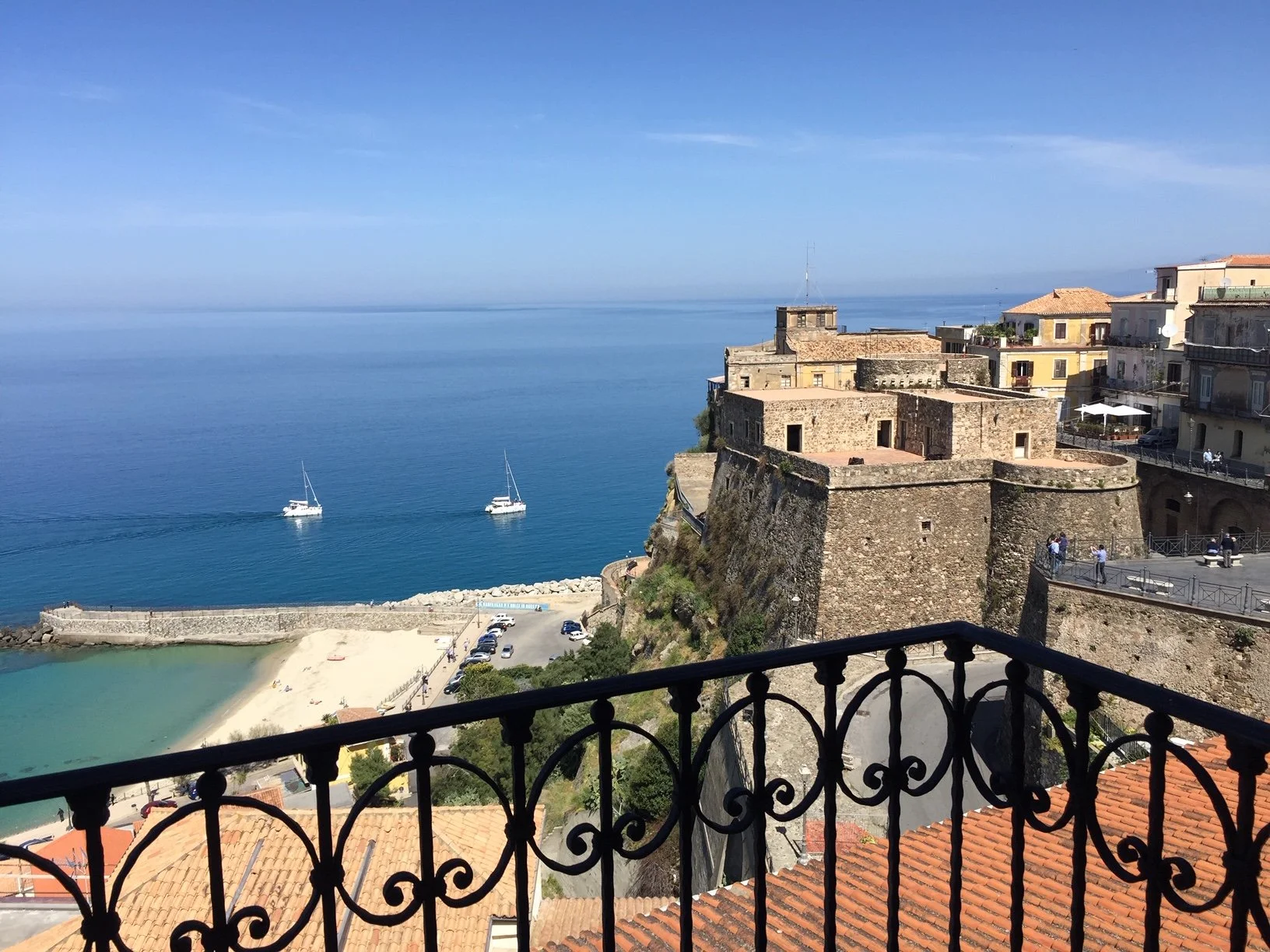
First I thought, there is something wrong about the second drawing. But then I realized, I had never seen the back of the house in that way. - Remember? We are located on a rock. You only would see the house in that perspective if you would 'fly' by. Usually you are about 50 meters below and in that perspective the house looks different,... shorter, shrinked, somehow.
What about using the main facade as a 'logo'. I was thinking of designing a 'logo' for dishes we would use in the palazzo. Maybe also to be embroidered on bathrobes, maybe napkins, maybe pillow cases etc.
Should the 'logo' resemble more the new drawing (above) with all the nice details or resemble more the 'reduced' drawing below?

Let me know what you think and I will post a draft soon.


