Inspiration

This blog exists because I love to be creative.

However, lately, I have not been so creative in writing blog posts. My apologies. And thank you to all of you for still sticking with me.

For those who want to know - and maybe the new reader, I will explain, the reason(s) why I was reluctant to blog:
Lack of idea
  • After having finished 99% of our renovation and decoration project, there is not much left to report about the palazzo.
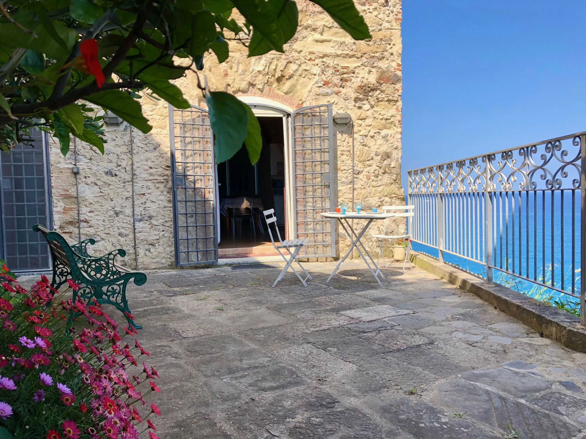
  • Also not living in Italy permanently, does not provide me with many new stories from the village life in the beautyful South.
  • There are so many blogs around these days, that good new stuff that hasn't been explored inside out by others is difficult to find.
  • When I write I want to deliver quality, well researched things. I try not to just briefly touch a fashionable topic.
  • When I press the publish button, it's because I have to tell something. Something that worth to be printed. Something that is entertaining and keeps readers coming back.
Lack of time
  • As I said above, I aim for quality. And that needs time. But nowadays, you need to be faster and faster if you don't want to be the last writing about a subject.
Lack of motivation
  • I started this blog in December 2006, so I am in my 7th year of blogging!! Mmmhhh, is it the seven-year-itch !!??
  • People seem to follow more and more other (faster) social networks, like facebook, like twitter, pinterest, tmblr .... than blogs. Maybe.

I was even tempted to sign up for a blog e-course with Holly Becker at Decor8.

As I said, this blog exists, because I love to be creative. Actually, I need to be crative! It enriches my life. Although, for a couple of weeks I have not been writing, I have been creative elsewhere:

I am into photography since some months. I know now how to use my digital camera in the manual mode. I learned that prime lenses are giving better results than standard zoom lenses, and that the body is less important than the lens. Over the past days I played around with the free trial version of Adobe Lightroom. I learned how to improve photos in the post process. And, very important, how to insert a copyright into the metadata of a photo - or even better, into a whole batch of photos.

On top of photography, I did some weekly painting. First with a maestro artist who helped us students when stuck. After a year or so, I gave up to paint with him since I was not able to paint without him anymore. Slowly, I started to paint again, just by myself, and with a group of ladies who use different media and techniques.

Over the time I realized, how photography and painting are inspiring and complementing each other. I grew with both. I also came across many artists. Some I heard before, but most were new to me, especially the photographers. Very Inspiring!

I am always curious about an artist's life and where famous artists got their inspiration from! Often from each other!

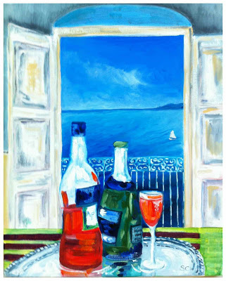
The other night, I looked up my favorite post-impressionists on my iphone... for hours...The next morning I woke up, sleepy though,  I finally knew what to paint on my pink canvas.

In one session I almost finished the painting. Now, just some glazing (shadows) is missing. I posted it on FB and my friends liked it. I got compliments from art connoisseurs, form art buyers and even a successful artist friend. If I continue to be productive like this, I will be able to participate in the exhibition of my art group at the end of this year. - The only problem is, that the exhibition's target is to sell paintings. - Ha ha, I am not sure, if I can separate from that bird?!


oil on canvas (40 x 50 cm) by me


For future inspiration, I always collect photos and art work in files on my personal computer, ipad and iphone. But today I had an idea. Why not share my inspiration on my blog? I will have a new label "inspiring art" and feature painters and photographers I like. Here we go, same purpose of blogging as before, filing my inspiration online (and finding them in cyberspace always)!

And so, after photography and painting for many months, I am happily back to writing again.
What a connection!
Waiting for Summer

Before lunch at Palazzo Pizzo (oil on canvas)

This is a very cold February, and the snow has even reached Southern Italy. This is less fun than in more Northern parts of Europe. In the South, the houses are not as well prepared for cold winters. Furhter more, heating costs are very high in Italy. So it happens sometimes in winter, that outside in the sunshine it is warmer than inside the homes.

So, let's think some warm thoughts.

When I look at my newly finished painting (above), I think of summertime in Pizzo. I enjoyed last summer very much, especially the aperitivo "Aperol Spritz" between beach and lunch. I had to paint it in oil on canvas. The view is the one from our kitchen or dining table.

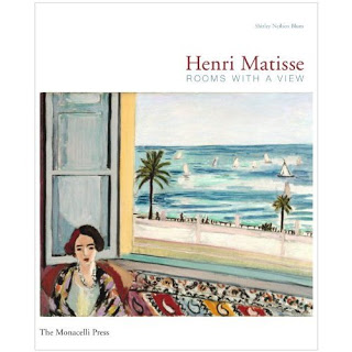
I love rooms with sea view (who does not?). One artist, who's artwork I admire a lot, is Henri Matisse. He actually painted a few rooms with sea view. It is facinating how he captured the atmosphere inside and outside the room.

And that's why I will add this book to my collection. It's all about Matisse' rooms with a view:

Sicilian traditional tiles as main design theme for new contemporary resort: Verdura Golf & Spa Resort

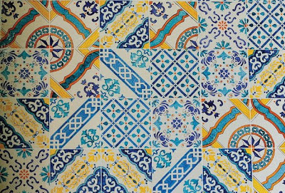
Southern Italy, especially Capri and Sicily, is famous for its beautiful ornamented tiles with bright mediterranean colours. Handpainted maioliche have their origin in Mallorca (Spain) and have inspired Italian crafters from Vietri near Naples to Caltagirone in Sicily.


It is kind of obvious to use mediterranean tiles (piastrelle) when renovating or remodelling a house in the South of Italy. Even when building a contemporary house or hotel, one should consider to catch the atmosphere of the location by using local traditional material and patterns in some way.

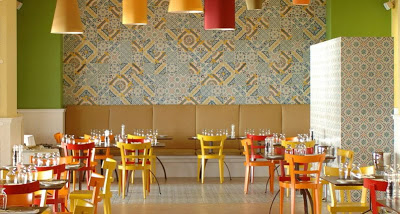
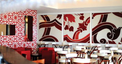
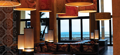
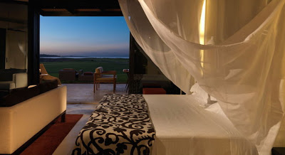
In a rough Southeastern Sicilian landscape the new Verdura Golf & Spa resort combines contemporary architecture and design with local Sicilian culture and tradition. Interior designer Olga Polizzi found a simple way to retain old customs by interpretating patterns of Sicilian maioliche (tiles) in a modern way throughout the resort :

patterns of piastrelle are remixed in the casual dining area (above and below):


The giant tiles are handmade by a workshop in Caltagirone.
They pick up a local motif of the 18th century that became the decorative theme of the entire resort.

In the lobby, cushion covers and lamp shades pick up parts of the tile's pattern.
Even the webside of the resort is using the theme on its pictures (see above pic left side) like a watermarking.

In the rooms the theme is on bed covers, cushions and lampshades.

On some walls the design of the tiles is stenciled. However, with very restraint colours, like a watermark, to not be too much for the visitors eyes.

I think it is a very clever idea. I might 'copy' this method for some wall decoration in our house. I could re-use some pattern of the few old tiles we inherited with the house. Although they have more a Greek influenced geometrical design than a floral elaboration. Or I am just painting the above red giant extract of a maiolica with acrylic coulour on a wooden board for one of the rooms.
*  

Source: all photos via Verdura Golf & Spa Resort, Sciacca, Sicily
owned by Rocco Forte Collection
featured in AD Edizione Italia, March 2010

Project by Flavio Albanese
Interior Design by Olga Polizzi

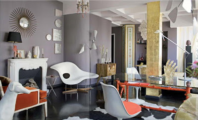
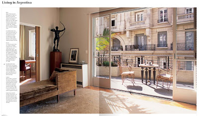
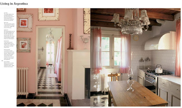
Inspired by Living in Argentina

It is not Italy, but maybe the South American country with the most European touch. Many Italians came here to live and you can feel the influence.

walls : grey, floor : black, column : gold, lamps : 6, accent colour : coral
wow ! what a glamorous eclectic mix !


Buenos Aires, the Paris of South America

curtains used as closet door and room divider

countryside house in Argentina (reminds me of a "maison de campagne" around Fontainebleau)


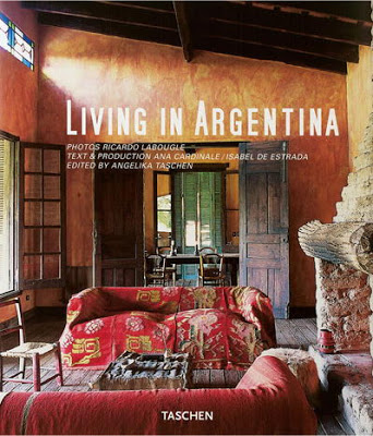
All above beautiful images and many more can be found in this book :


available via :
Amazon.com (19.79 USD)
or
Amazon.de (19,99 Euro)


I browsed this book online here because my blogger friend N. was so excited about Buenos Aires after she spent a couple of weeks in Argentina. And I heard other people saying that Buenos Aires is a mix of Paris and Barcelona. So I got curious and checked this book by Taschen (language: German, English, French) which of course is not a travel book but purely about interiors. However, these eye-candies make me want to travel to Argentina right away.

And that's what the editor says: Argentina considers itself the most European of South American countries as Argentineans have a strong connection to the old world. When it comes to decorating, they have a great talent for bringing together the old and the new, with subtle touches of color and rich textiles.

FYI : in case you order this book or any other product via my amazon links I receive about 5% commission through their associate program. In this case about 50 cent ... so if you order 10 copies, it would buy me a coffee !! (ha ha! thanks !)

Photo source: Taschen

Decorating with Colours


Maison Jaoul (finished in 1955), Neuilly (Paris) by Le Corbusier
(photo from a book "Le Corbusier" by Taschen)

If you have a house with many white walls and surfaces and not that much art work to hang, the best way to decorate your house is to paint large surfaces with bold warm colours that are rich in contrast.

Lately I got inspired by my friends new house. She used a Feng Shui colour consultant and ended up with a colourful house that radiates warm and cosy feelings from the very first moment, although the moving boxes were still unpacked. The result is quiet interesting and I have to ask her if I could post some pictures. In some rooms walls were painted with three different colours. Seems too much to me, and many others. Lets wait and see until they have lived in there for a while. But also magic colour tricks made disappear corners and widen small windows.

And since I need to add 3 doors for buil-in closets in my (German) home, I think to use bold colours for the surfaces. At the moment I fancy a kind of lobster red for a single door for my bathroom. And around the corner, in my home office, I fancy some fresh green or blue or yellow for a double door. As the 3 doors are so close to each other (the sliding door to the bathroom is always open) they can create a fun colour contrast. A bit of "Bauhaus" style in my appartment...


I played a bit and matched the above 3 colours (via Farrow & Ball).
This colour combination was often used in the 50ies by architects and designer.


very similar colour match in a loft in Paris via Cote Maison (photo by Philippe Garcia)


"arty" colours of the 50ies (jade, coral and yellow) used in a French appartment via Cote Maison


more interior of maison Raoul (via "Le Corbusier" by TASCHEN)


bedroom in maison Raoul (via flickr)


One more time the Claude and Duval factory by Le Corbusier (via wallpaper) to show the colour combo that keeps me fascinated.