Stunning entrance room with Chandelier

Bohemian crystal chandelier and another blue ceiling

Angelo surprised us with an impression of the entrance room.
LC, my son, and I were speechless starring at the screen of the computer when the picture opened up. Not only the chandelier, that is a gift from my mother-in-law, who found the chandelier one day on the street (!) slightly dammaged and with missing parts and had it restored, but also the choice of blue that Angelo painted on the ceiling - both together looks so stunning! Angelo said he mixed colours we did not use in the living room (see colour testing in the living area) and tried out different shades until he was happy with the result. I am very happy too!

Stuning surprise again, GRAZIE !
Looking forward to the master bathroom surprise coming tonight via email...

Going crazy over crazy tile mix ...

outstanding nichia (niche) - LOVE IT !

previously planned "frame" with Greca blue (from bathroom)

new "frame design" with real tiles (to be installed) after my photo of paper tiles

new idea: only 3 rows of tiles on nichia's side walls

... today I was emailing, text messaging, downloading and re-designing a lot. We are running short with our tiles. I knew from the beginning that it is just enough what I ordered. The thing is, when you have a crazy mix and run short, you have a problem. I could have ordered an 8th design, but could not find any good match. But I could not go for a second box of one of our designs since then the whole mix would not be balanced anymore. So I hoped.

Then I realized I had done a calculation error within the nichia. I had forgotten the ceiling or buttom... So very little chances we would have enough tiles!

We added a few bathroom tiles already into two walls to gain a couple of extra tiles.

I made sure the mix was balanced at all time to have a kind of harmony in the chaos. With my paper tile arrangement it looked fine until the end. But today Angelo sent me a picture of the tiles we have left for the bottom of the nichia. Surprise. It is not what I have calculated with all my paper tiles here thousand of miles away. Of course nothing balanced anymore. I will need to place bottles of olive oil and pots with kitchen tools on top of some tiles to make them disappear. Problem solved.

But more stressful was to stop the "frame" of the nichia this morning. Last night, CC saw my draft with blue Greca tiles (left-over from our bathroom) that should work as a "special" frame - and he did not like it. I knew it. I kept it as a surprise, like Angelo does sometimes. Maybe for this reason... as I am not very convinced myself.
"It looks like we run out of tiles!" he said.
"Yes. Actually, that is the purpose of patchwork: using left-over pices to help out...", I replied.

Okay, before ruining the beautiful art work, I decided to design a new frame.
We text messaged at night to Italy, to make sure Angelo opens his emails in the morning and stops Tonino in time.

This worked out fine. Before Angelo woke up, I had emailed him already the new frame this morning from Bangkok. I also redesigned the sides and ceiling.

I took many pictures of my paper tile arrangements. I added notes to avoid misunderstandings. I looked at it again and again and at the end, I came back to an idea from the night before:

Why tiling all the side walls and ceiling of the nichia? It looks so stunning on Angelo's photo. It stands out. Will it not be overloaded with more tiles? If we do only 3 rows inside the nichia, corresponding to the outer walls, we would also have solved our tile problem !!!

What do you think? You only have a couple of hours to reply until buys workers in Italy go back to work!

Oh my God ! My crazy Tile Mix turns out Sensational !

I LOVE IT !!! Grazie Angelo, Tonino & Mimmo, baci a tutti (even if you don't like it) ! I am so happy to see the fantastic result !


Since the tiles have arrived yesterday, I knew, there is a chance that Angelo sends me first impressions of the crazy mix during lunch break in Italy. I was so excited and could not wait to see it. I am relieved how beautiful, how bright and colourful "my mix" looks like. I worked hours on it with tiny paper tiles deep at night... Grazie mille for following "my design"! (was someone swearing about the work?)

I am looking forward to see more pictures soon.
Meanwhile, I will show the photos that were used as model today:

wall no 1 - and "frame" for niche (coming)

wall no 2

wall no 3

wall no 4 - the wall inside the niche

For the entire mix I ordered seven different types of Vietri tiles. - The sales woman at Callipo who knows us well since the start of the renovation was not very convinced. - Each pattern came in a box of 25 tiles, equals 1m2. As I did a calculation mistake I had to include 8 left over tiles from a pattern we used in the masterbath. And additionally I created a kind of frame around the niche (which will show later) out of another 6 left over tiles from the bath.

In total, the workers had nine (!) different boxes to select the correct tiles from, one by one according my master plan. I am very happy they did not refused to do so ! ;-)

And if Franceso de Maio wants to copy that mix for their new catalogue they can name it "Palazzo Pizzo" since I have a copyright now!

Colour Testing for the Masterbath and first Results

You might remember my wild mesmerising Vietri tile combination in our master bathroom (and here). There were doubts if it should remain like that with white walls. Or whether we paint the walls in a deeper blue at the same hight as tiles end behind the sink and toilet. - Let's try it out we said:

greenish paint from the 1st colour testing in the  living room

Although, we had a deeper blue in mind, I saw during the colour testing in the living room, that the greenish paint would perfectly match the wall tiles in the masterbathroom. If we would not use it in the living room, we could use it up here.

view from further away

But the floor tiles are totally different and the contrast to the wall would be even bigger than it is already now. That's why we had already bought a blue colour sample to try out in the bath. It is the same metallic antique type paint we are using in the living room.

metallic "antique" blue paint

Nice try. But the metallic effect is too strong in this bright room and the blue does not really match the floor either. Angelo had to cover the trial again with white paint and find a new solution. We did not dare to ask him to do a "spatulato" wall. This is a traditional Venetian finish. Originally made with chalk powder, oil, natural glue from animals and natural pigments. Nowadays, acrylic or vinyl resin is used, but it still requires a lot of work. But Angelo proposed it himself!

spatulato finish 

This is the only photo Angelo has send from the wall. I guess, at that time the other walls were not finish or the room was still too messy to shoot a photo from the entire room. 

bathroom ceiling

But we have ceiling photos. It is a light blue, but not as light as used before in the piano terra for the ceilings of the entrance #37, the kitchen and the window's niches. I asked him to match the blue a bit with the blue of the wall tiles. I think he used the same hue as used on the ceuiling in the corridor in front of the green bathroom. And this is perfect!

bathroom walls and ceiling

A white stucco border was added on top of the mid-hight tiled wall and runs now around all walls. The colour of the ceiling is taken down on the wall to form an app. 20 cm wide border. This reduces the felt hight and is supposed to make the room cosier. This blue border is also limited by a stucco border, that is however a bit wider than the first stucco border. Inbetween the walls Angelo used the same "pearl" white or grey paint as in the living room. The grey colour is supposed to look warmer than a plain white.

I am myself curious how the wall looks behind the bath tub and on the opposite site! Angelo, please send more photos!

Colour Testing for the Living Area and Results

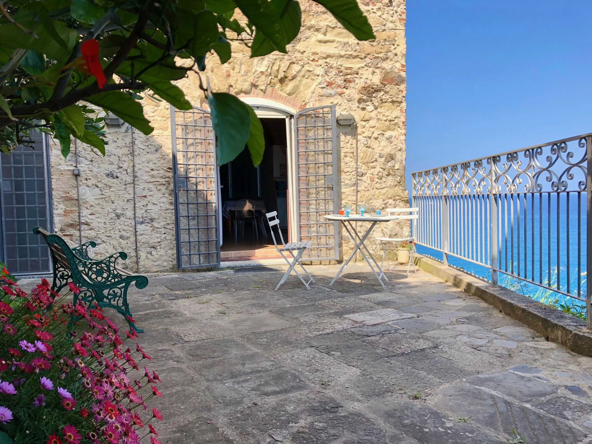
While I was still in Italy, we had to decide on the colour for the living area - which includes dining and kitchen since it is an open floor plan. We wanted something bold, something mediterranean. CC first thought of an orange-red, as we found this colour under a white paint coat and thought this might make sense. However, while in the room, we sented a red colour would distract too much from the beautiful sea view. "We should adjust the room colour to the outside landscape and use a blue or turquoise instead", we said.

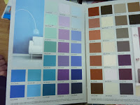
So, we went to a shop in Vibo Marina and looked into the colour palette:

The colours (left) are mixed by a machine on site and you can even get it in smaller pots to try out the result.

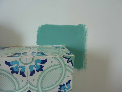
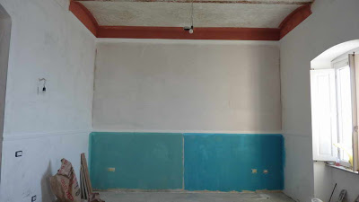
We chose two different turquoise blue, one more bluish and one more greenish. And for the cross-beams of the ceiling a rosty brown-red.


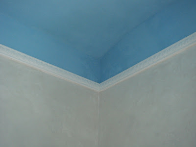
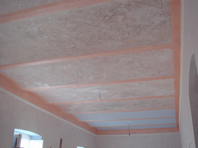
Here we go. Angelo has already done the two blue-greens for the wall and the brown-red for the ceiling beams and borders. Both colour areas are limited by a white stucco border.

colour testing result number 1

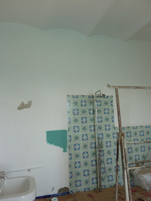
No... First, the ceiling border is too dark, too strong, too bold. Second, although we liked the blueish greenish walls, we felt it's too cold. It was April and it was still fresh outside and even more fresh inside the house. So we said, we better go for a mediterranean orange or a sunny yellow that, hopefully, will increase the felt temperature by maybe 1 or 2 degrees.

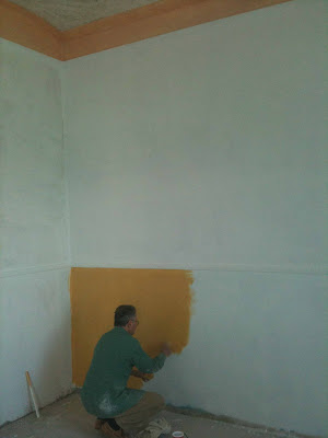
In Vibo Valentia we went to Enel Arena and chose some yellow and orange toners that were to mix with a certain quantity of white paint.

The new paint (left) is ment to give an antique effect due to the method of brushing unregular short strokes onto the wall. It also has some metal particles in it which was not really what I want, but it reflects light, and why not give it a try since Angelo was keen to work with that colour.


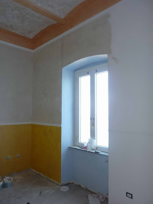
colour testing number 2

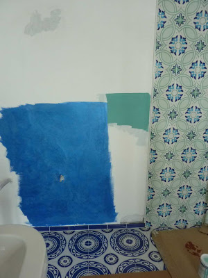
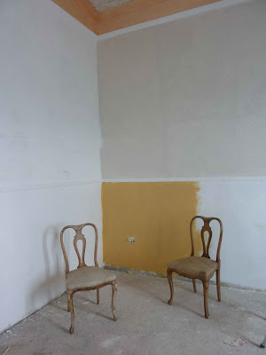
First, Angelo had to prepare the wall - again - by covering the previous blue colours (from the testing number 1) with white paint, wait another day for drying and then finally try out the new sunny yellow. Also the ceiling border got a lighter colour. It looks like flesh taint - or lets just call it "peach".


So, how about that orange like yellow? - And how do you like my two new chairs that I got for "free" from our antique dealer?

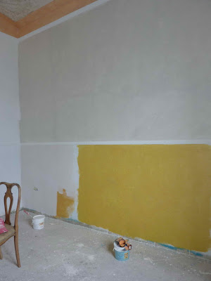
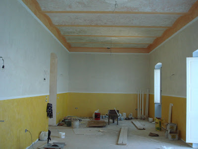
Colour testing number 3

But wait, we got another more yellowish yellow ! And note, that the wall above got a "pearl colour" paint!

Colour test number 4

Or should we use the orange paint on the left wall? - It was the kind of orange-red we found underneath a coat of white paint while restoring the walls. - My mother-in-law matches quite well with the wall that day...


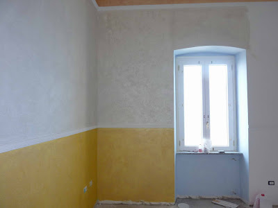
We decided to stick with that brighter yellow, sunny and warm. Colour number 3.

light blue in the window niche

And since we are into colour testing. How about some light blue? Angelo still has some left over paint. It looks good in the window niche.

The light blue window niche from a different angle.
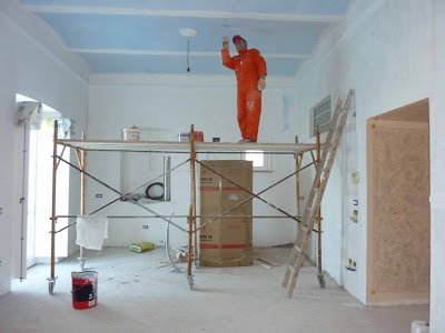
Angelo in action

Angelo is known to like blue... And since there was more light blue paint left, he continued to paint the ceiling, but only where no fresco was found. 

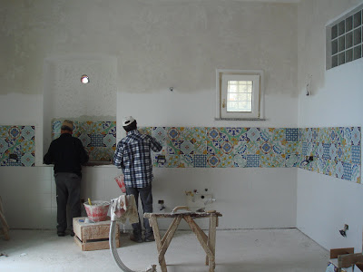
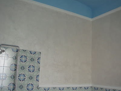
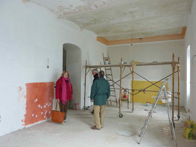
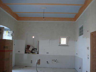
AFTER: ceiling finished, walls painted and prepared with tiles for kitchen

view towards dining and living area where the ceiling has some rudimental frescos


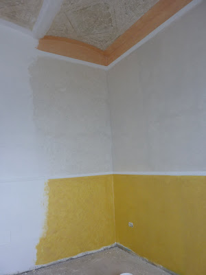
Now, we could muse if it looks good or not to have the yellow paint only until a hight of approximately 130 cm - and why not overall. I think, there are three reasons why to do it that way:
  1. The ceiling is quite high, maybe 3,50 m - With two or even 3 different colours and borders it "shrinks" a bit.
  2. The open space is kind of a "tunnel" with a length of 13,50 m and width of 4,50 m (before there were three diffrent rooms separated by walls) - The way the space was painted should open up the situation.
  3. I learned that an old Italian palazzo in the very South of Italy, sourrounded by more old houses and the sea, cannot be renovated with a Northern European thinking or even more with a modern taste. Of course you can add this with accessories or furniture later. But every single room needs some basics that reflects the Southern atmosphere, or something very Italian, or even old fashioned from passed centuries. Be it the floor, the walls or the ceiling. - When I am in this house, I want to feel the difference to other countries and cities, not only outside in the narrow alleys, also inside the house in every single room.
  4. In case we would need to re-paint the walls in a couple of years, we can think this over again... But the years will add cracks and marks, the colour will fade and patina will come and make it even nicer. 

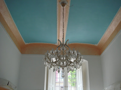
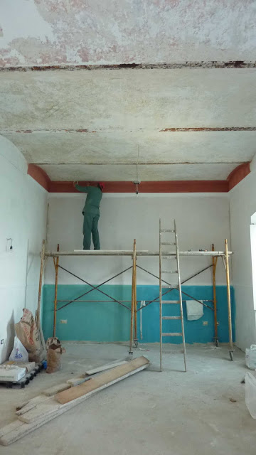
The result of the ceiling - a work by Angelo

This ceiling of our living, dining and kitchen area, as seen above, was a work of several weeks by Angelo who laid bare the frescos - or what were frescos in the past -  with a special cutting tool. This worth a separate post with more details (coming soon).