Facade Coloring

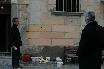
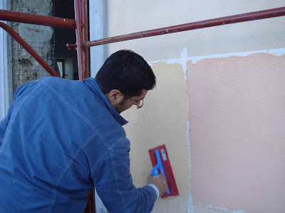
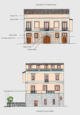
Our color has no name (I would have choosen something like "Light Bellini"). It has just a number: "731". It is not that much yellow like the colors above it, that my husband prefered and it is a bit more yellowish than the pinkish ones below and on the right, I would have prefered. It is the color that the architetto recommended. A pretty compromise. I think we couldn't go wrong with any of these eight cremy colors. And you know what? On the seaside we painted six out of the eights (decision making process) and they look different! This is because the surface on that side of the house is smoother and the light is never the same.


Click on the picture to enlarge and see the green check marks: this is our color!

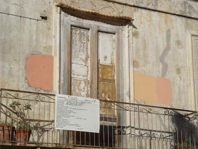
And I did some facade coloring today. But just on paper. And as the scanned result did not turn out good enough I used the computer as well. It still has a bit of a dirty look, but it would take me hours to make it nicer. I hope Angelo and the architetto (who might be able to provide a better design? aiuto per favore!) understand my suggestion of how to paint the different areas of the main facade. The sea side facade is easy - same pattern like it is today.


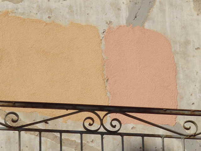
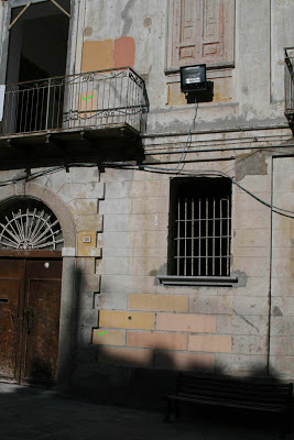
Click on the photo to enlarge.

About Colours

I am back from Italy. And I do not know where to start. To not forget anything I wrote a little journal. It is about 33 pages long. - I could start from the beginnging with the rainy and pretty cold days in the beginning or I could do a summary about all our decisions. But for tonight it is too late, I have to recover from an Air China flight from Rome to Beijing ...


Therefore, for today, I will leave you with two pictures about colours as I have been talking a lot about how to paint the facade and I got a lot of comments from many readers. Above is our Architetto Pino Pitt looking at our house while more colour samples are going to be painted on the facade.

And below you see my husband and the architect discussing about the new eight colour samples. It is a story for itself how we came up with these eight colors. When the painter came with his colour booklet my husband was busy talking with the plumber (il hydraulico) and asked me to choose two more light pinkish tones. As I could not decide myself in three minutes, the architect helped me to go for one more pinkish tones and then choose himself five more tones. Mainly yellow based. I like yellow too, it is warm and sunny. It was funny to see, how my chances for a pink was diminishing.


So can you guess, which colors were my favorites, my husband's and the architect's? The final decision will be posted tomorrow. And it cannot be reconsidered as the architect ordered the colour the same day we made the decision (probably he knows women and their decision making process).

Pink Pigment's Problem?


All comments and emails I got vote for pink! The pink of a 'pale rose', 'faded coral' or 'Aurore's cheeks'!

But today I received the email of my renovation experienced Italian friend (mother-in-law's cousin's wife). She said the following:

"In my opinion I prefer yellow because pink colour with the time is making some horrible black stripes along the windows and it's not fine to be seen.
Right near my house (ed. remark: between Padua and Venice) there's a pink villa that looked beautiful when it was finished but, after a few years, they are renovating it because of this dirty look.

Someone told me that there's a pigment in the composition of pink colour which gives this black result when time passes by. I don't know if that's the reason, but now I'm careful about all pink houses that I see and I must say that it's true.
By the way, we did our house in yellow "ocra" and I'm happy of our choice."

So I am wondering what is it about that pigment?
The two photos above show houses in Pizzo. They look newly painted - and impeccable.
But when I look at our house ... dark stripes ....

We will ask around. Maybe some of you know?

Pink or Yellow?

It is time to decide about the colour for the outside walls.

Pink?


Or yellow?


Pink?


Or yellow?


This is the picture I got as a proposal. Difficult to tell on the screen what this color would be on the wall. Is it more 'yellow' or 'orange'?.

It is a coloured plaster. Different from painting on plaster. Some technique that gives the facades a kind of antique look.

I really like the colour of the seaside facade. We call it 'pink'.
Although, to me, it is more a 'pale coral'. (I think of the coral fishers that used to dive for coral underneath the house).


BTW, the seaside facade's color is the background color of this blog!

And I think that the blue tiles fit perfectly to this 'pink'.


But would it look good on the other facade that faces the piazza?


Maybe?


(We want to paint three sides of the house in the same color and leave the one stone wall as it used to be for the last 200 and something years.)

Picture source: drawings of the house by Pino Pitt (colored by me);
other picture by me, except the yellow palazzo which is the Xara Palace in Malta via Architectural Digest magazine.