Colour Testing for the Masterbath and first Results
/
You might remember my wild mesmerising Vietri tile combination in our master bathroom (and here). There were doubts if it should remain like that with white walls. Or whether we paint the walls in a deeper blue at the same hight as tiles end behind the sink and toilet. - Let's try it out we said:
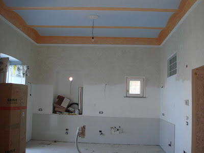
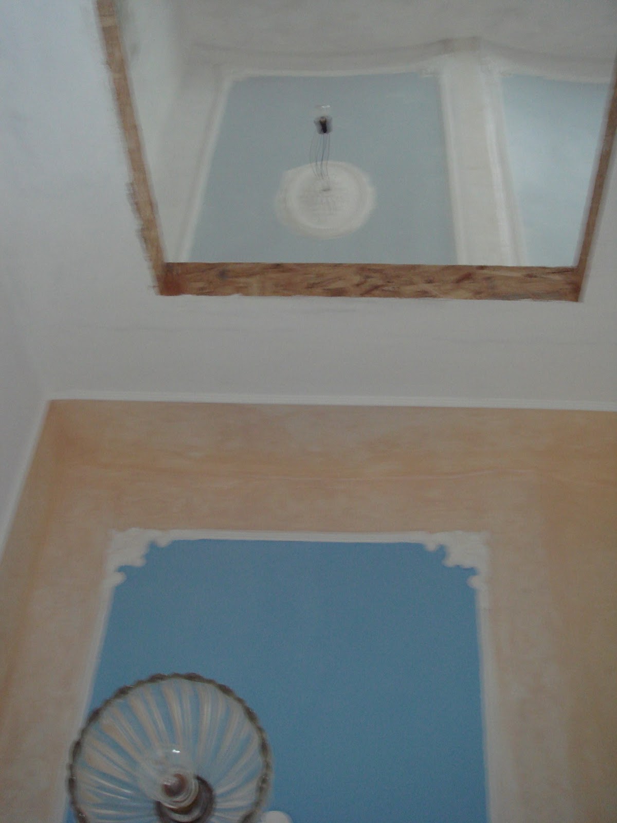
But we have ceiling photos. It is a light blue, but not as light as used before in the piano terra for the ceilings of the entrance #37, the kitchen and the window's niches. I asked him to match the blue a bit with the blue of the wall tiles. I think he used the same hue as used on the ceuiling in the corridor in front of the green bathroom. And this is perfect!
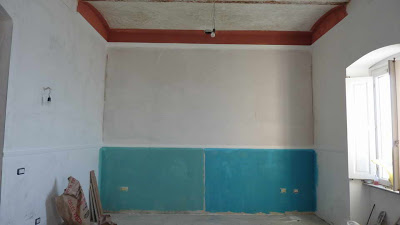
A white stucco border was added on top of the mid-hight tiled wall and runs now around all walls. The colour of the ceiling is taken down on the wall to form an app. 20 cm wide border. This reduces the felt hight and is supposed to make the room cosier. This blue border is also limited by a stucco border, that is however a bit wider than the first stucco border. Inbetween the walls Angelo used the same "pearl" white or grey paint as in the living room. The grey colour is supposed to look warmer than a plain white.
I am myself curious how the wall looks behind the bath tub and on the opposite site! Angelo, please send more photos!
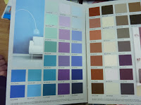
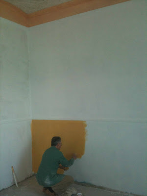
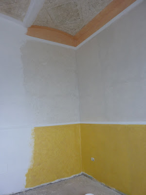
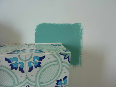
greenish paint from the 1st colour testing in the living room
Although, we had a deeper blue in mind, I saw during the colour testing in the living room, that the greenish paint would perfectly match the wall tiles in the masterbathroom. If we would not use it in the living room, we could use it up here.
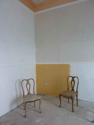
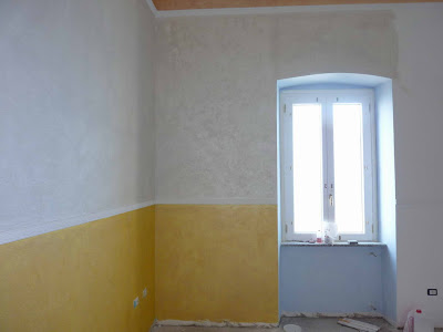
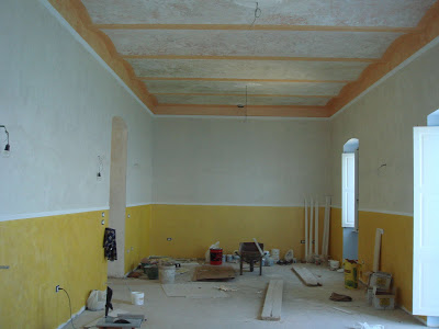
view from further away
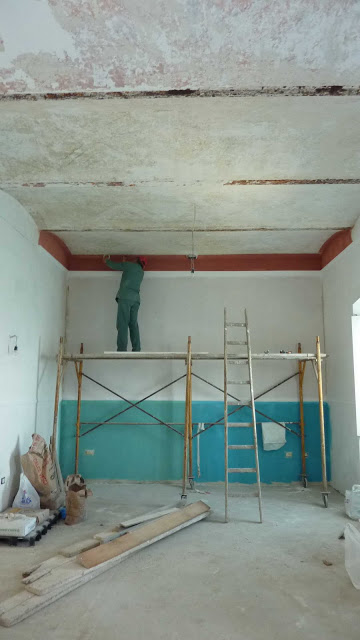
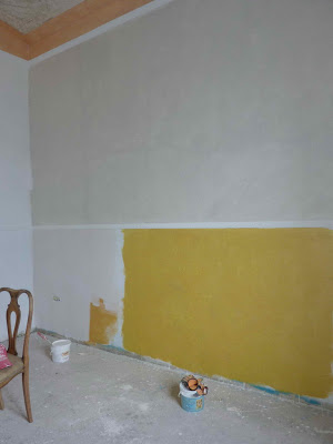
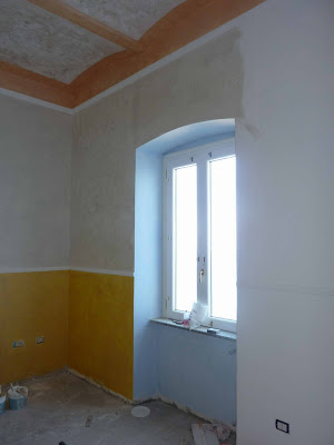
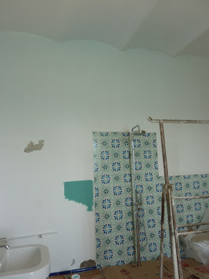
But the floor tiles are totally different and the contrast to the wall would be even bigger than it is already now. That's why we had already bought a blue colour sample to try out in the bath. It is the same metallic antique type paint we are using in the living room.
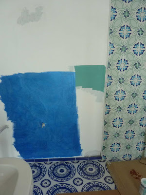
metallic "antique" blue paint
Nice try. But the metallic effect is too strong in this bright room and the blue does not really match the floor either. Angelo had to cover the trial again with white paint and find a new solution. We did not dare to ask him to do a "spatulato" wall. This is a traditional Venetian finish. Originally made with chalk powder, oil, natural glue from animals and natural pigments. Nowadays, acrylic or vinyl resin is used, but it still requires a lot of work. But Angelo proposed it himself!
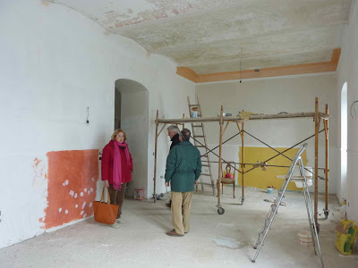
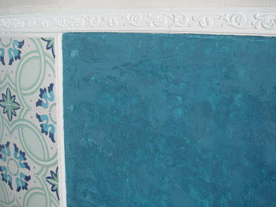
spatulato finish
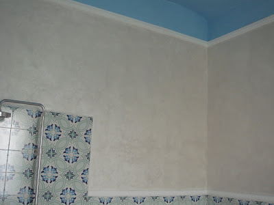
This is the only photo Angelo has send from the wall. I guess, at that time the other walls were not finish or the room was still too messy to shoot a photo from the entire room.
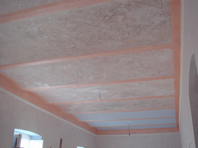
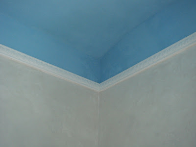
bathroom ceiling
But we have ceiling photos. It is a light blue, but not as light as used before in the piano terra for the ceilings of the entrance #37, the kitchen and the window's niches. I asked him to match the blue a bit with the blue of the wall tiles. I think he used the same hue as used on the ceuiling in the corridor in front of the green bathroom. And this is perfect!
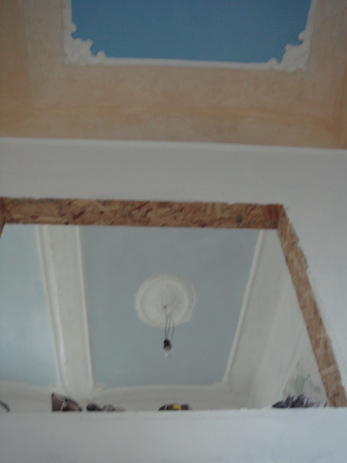
bathroom walls and ceiling
A white stucco border was added on top of the mid-hight tiled wall and runs now around all walls. The colour of the ceiling is taken down on the wall to form an app. 20 cm wide border. This reduces the felt hight and is supposed to make the room cosier. This blue border is also limited by a stucco border, that is however a bit wider than the first stucco border. Inbetween the walls Angelo used the same "pearl" white or grey paint as in the living room. The grey colour is supposed to look warmer than a plain white.
I am myself curious how the wall looks behind the bath tub and on the opposite site! Angelo, please send more photos!