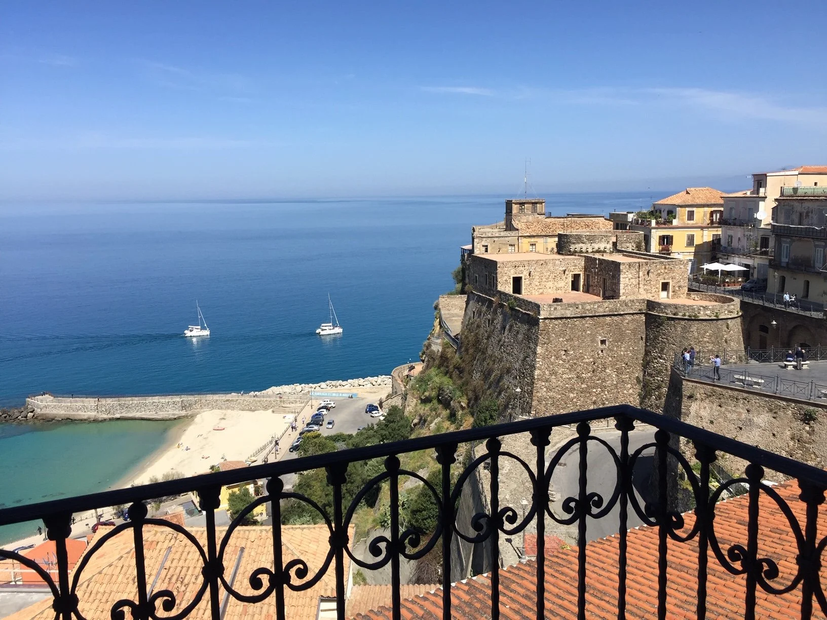
Focus on Kitchen


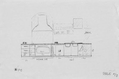
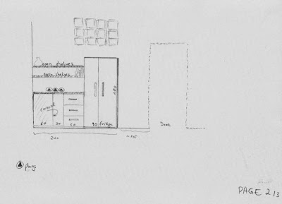
That's the actual situation: a niche with a hole for the hood. The balcony access that should not be blocked by the kitchen island. I think a kitchenette or L-shape with our stand alone 2 door inox fridge on the right (below the glass bricks). And it looks like we better have shelves instead overhead cabinets on this front!

In only two weeks from now I have to pack... we will fly to Italy ! The main purpose why we are doing this trip - in between a skiing holiday in Europe and our summer holiday in Italy - is because we need to make some major decisions, and this is about the KITCHEN !!!

The kitchen, not only in Italy, is the center point of the house. Nowadays, there are mainly open kitchens planned in new houses or remodelled in old houses. Kitchens are connected to dining and living area by just a kitchen island. Friends and family gather together around the kitchen before, during and after cooking and eating. Kitchen islands play a key roll. They are not only the new "border", they provide additional working space, they offer useful storage and often feature appliances. With stools they can be used as breakfast area, laptop work area - to check recipes ;-) or simply invite for an aperitif to accompany the cooking.

You all know that, and I am not a kitchen seller. This is just to remember, how important it is to choose the right kitchen design! It should matches the style of the house, especially the dining and living area.

That means for us a balancing act:

Our house is some 200 or 300 years old. We do not have a dining area yet. It will be a sleek long wooden table for sure. Chairs, not decided yet. Modern and comfortable for sure. Two modern sofas, we have shipped in from China, they are "close" to the modern B&B Italia style. We love inox steel appliances. We have a bulky 2 doors inox Siemens fridge (shipped in from China, hope it still works!). And we plan to have an inox oven and stove from Arniston or Smeg with inox hood.

Country style could work, but a bit more modern and maybe glossy surfaces would be nice too.

So I sat down, yesterday, and clicked through my kitchen resource links (on my new resource link page) and also browsed through my "kitchen briefing" file. But before it gets colourful and glossy here, I post our before and after layout and the kitchen planning drafts :

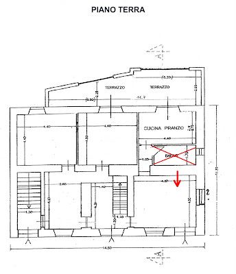
When we bought the house, we had the above layout at the ground floor (piano terra): a small kitchen with access to the balcony and a small bathroom. But big rooms all around. That's why we tore down all walls and moved the bathroom into another area.


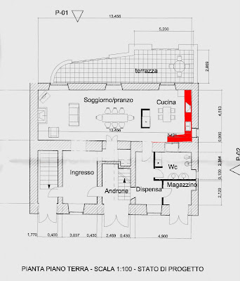
The "after" layout: the displaced bathroom gave new space to the kitchen. Initially the plan of the architect suggested to have the fridge in the middle of the room, to somehow separate the dining area visually from the kitchen. We will, however, not follow this idea, and install the 2 door fridge just opposite the balcony. (front 4,50 m long, side about 3,40 m until door)

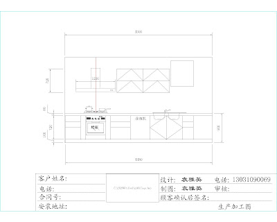
With a drawing by myself (see further below) and a rough layout of the ground floor we went to a kitchen company in Beijing that was quiet modern and very "Italian". The above plan is what they made for us.

And that is the front, seen from the dining area. The balcony would be on the left side.

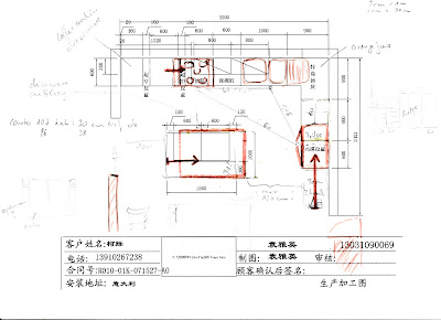
Above, my changes in red: We have a niche with a hole in the wall that will be the place for the oven, stove and hood (as before). The fridge should be closer to the sink and work space to make moves more efficient - according to the kitchen triangle. The island needs to be just a minimum space away from the fridge and not too close to the balcony door to allow easy and barrier-free walking.  


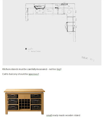
My drawings :-)


If over head cabinet, then maybe only on the left of the fridge or a full-length pull-out-cargo

We could look for a simple island solution. But meanwhile Angelo organised "water" access for the island in the middle of the room, which means we could have an extra sink in the kitchen island. This is of course always useful. However, the island will be small - and I would love to have enough space there for breakfast. I think two stools there or three - and enjoy the sea view (this you can't when sitting at a lower table).

The next post will be about kitchen again, but this time glossy photos for inspiration!

---
PS: In case you wonder why I ship things in from China to Italy - we lived in Beijing 2005-2008 and everything there is so tempting cheap!

PPS: Did you notice, I slightly changed the layout of my blog by adding "pages" below the header. How do you like the change? Does the blog loads still okay or is it slower? And how about the "read more..." button, is it disturbing to have to click to continue to read or is it okay? Thanks for giving a small feed-back :-)    

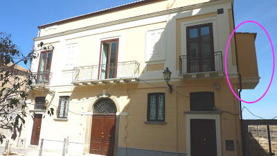
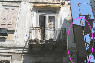
The tiny overhanging bath or former outhouse needs the perfect sink

Can anyone tell me how they called these overhanging shithouses people used to have in the medieval times in European cities ? (and elsewhere ?) I do not even know the Italian expression for these tiny outhouse loos.
Anyway, we have one! And it is going to be our son's bathroom.
In my previous post I gave a sneak peek into the ongoing renovation. It is another green bathroom. We have ordered all appliances, except the sink. Advise is welcome!

But look and read from the start:

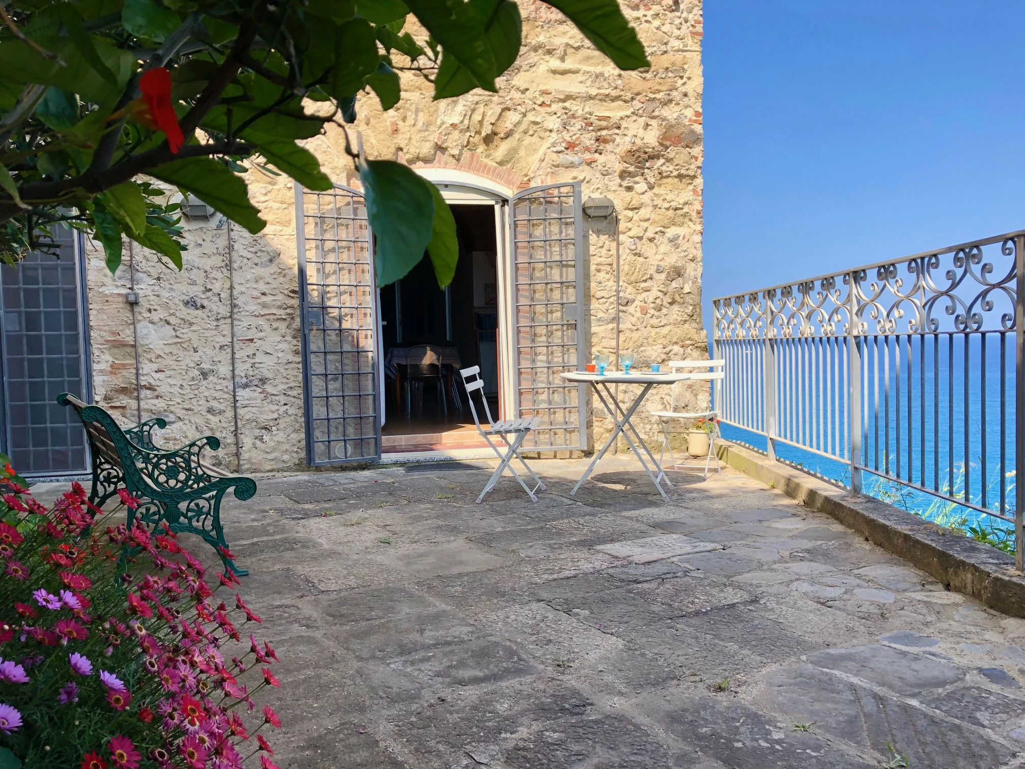
front facade of the house with the overhanging former outhouse on the right

 
a closer look at a BEFORE photo (we came a long way!)

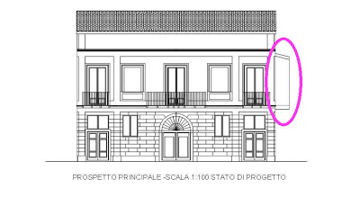
above drawing by the architect shows the former privy on the right

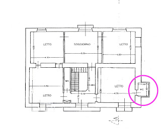
the layout says the WC is 1,90 m x 1,40 m


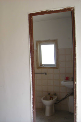
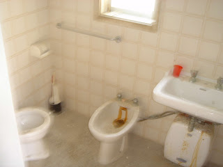
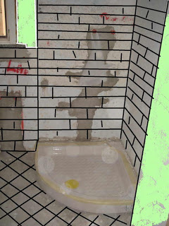
above and below is the BEFORE bath,
there were a WC (left corner), a bidet and a sink


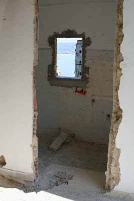
we took out everything (please note the "big" window)


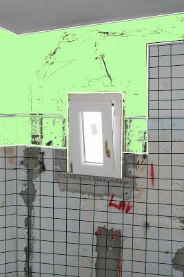
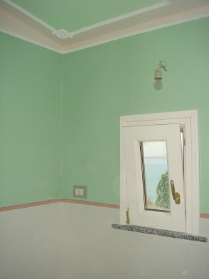
with the help of an AFTER pic (note the former big and now shrinked window!)
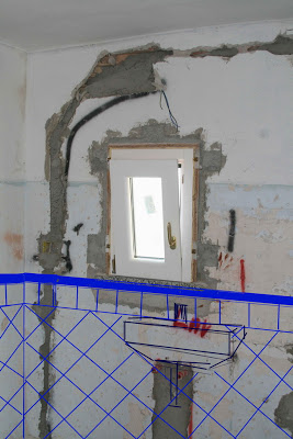
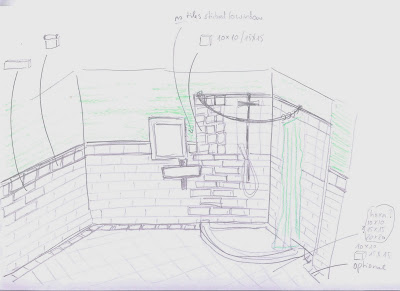
I made some tiles planning


And finally, see and enjoy what Angelo made out of my amateurish drawings :


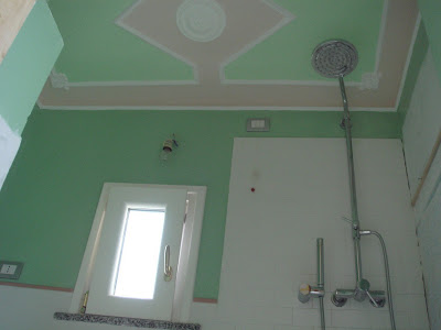
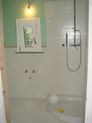
Shower tray, shower faucets and tiles are installed. Walls are painted. But what about the rest?

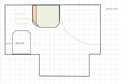
You may have noticed that the before bathroom had no shower, but a bidet. Now, we have decided that a shower is more important than a bidet. But we have another solution for "butt hygiene". We opted for one of the smallest WC, the Starck 3 compact model (360 cm x 474 cm), and will have a hose on the side of the toilet (like you often can find in Asia). This is simple, clean and space saving!

After all this, we still have not decided on a sink !
I have some tiny space saving sinks in mind and Angelo wants the largest sink possible.
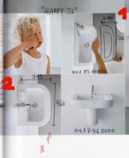
Okay, I used to have a tiny Happy D sink (see pic below, no. 1) in my guest toilet in Germany where you almost only could have washed one hand after the other.


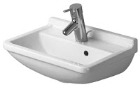
But the above Happy D (no 2) could do. It is 345 cm deep and 460 cm long - and it has soft round corners - ideal for a tiny kid's bathroom. But of course I can't decide just like this, quickly. There are other options by Duravit (and other manufactures for sure, that I have not checked), especially I thought of using the sink from the same series as the WC since we are in such a small room, it might be best to stick to the same design:


This sink comes in many sizes, but ours could be 450 cm wide x 320 cm deep (2 cm less wide and 2,5 cm less deep than the Happy D) or 550 cm wide x 370 deep, a compact version.

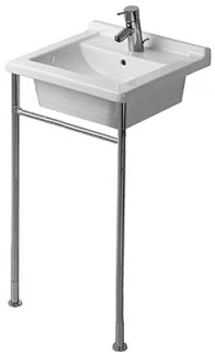
My sister has in her kid's bath room the above Starck 3 sink with metal console (480 cm x465 cm). Now, she lives far away from me and I cannot check if I would like it for our son. Not sure, the almost square sink and the metal console seems a funny match. But maybe a funny match is ideal for a funny bathroom?

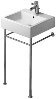
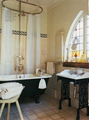
I would rather prefer the little pricier sink Vero. This metal console allows to hang towels on both sides. The smallest size however is 500 cm x 470 cm.

once more the site : which sink matches best ???


Since we use no longer the service of an architect or interior designer, just Angelo and me are thinking of sinks. Actually, it is only me. Angelo would buy a big sink. So, it was me who asked for detailed measurements and Angelo came up with a rough excel sheet. He added the shower tray, which is 80 cm x 80 cm. And a WC (not delivered yet), that I corrected to the given size. Then I added different sizes of different sinks. It all seems quiet tide to me. Since Angelo hates tiny dwarf or smurf sinks, we agreed on the following: we wait until the toilet is delivered and he is mounting it. Then he would do some test sitting on the toilet and check possible sink shapes. From this test he would send pictures to me which would help me to make a good decision.

If anyone of you has a recommendation, has a similar bathroom situation and knows a solution, knows the perfect sink, please email me at "writing (dot) suzie (at) yahoo (dot) com" or leave a comment below.
Mille Grazie !

Bathrooms Boudoir Style

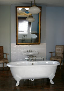
Would you split a big room into a tiny bedroom and an even tinier bathroom with no window? Assuming you have enough space, eh a palazzo? I rather opt to sacrifice one entire room to be a nice bathroom, 'boudoir'-style. Le boudoir (french) = the lady's room or "bower", means a room separated from the bedroom where you / ladies can bath and dress.

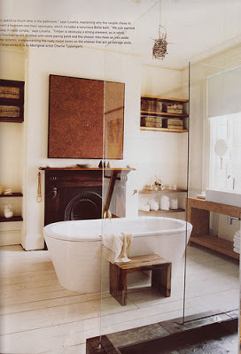
Here is my inspiring collection of bathrooms boudoir style:


For more inspiration see also my post about bathrooms with wallpaper. Only use tiles until half hight (like in the photo above). Then use color or wallpaper to turn the bathroom into a more cosy space.

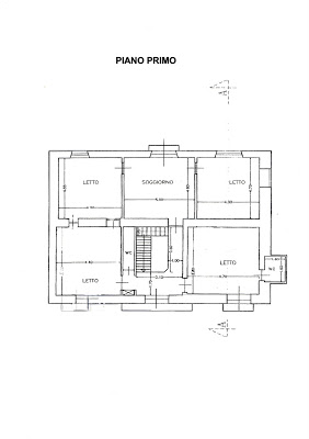
My only remaining question: which of the five rooms (below) should be our bathroom?

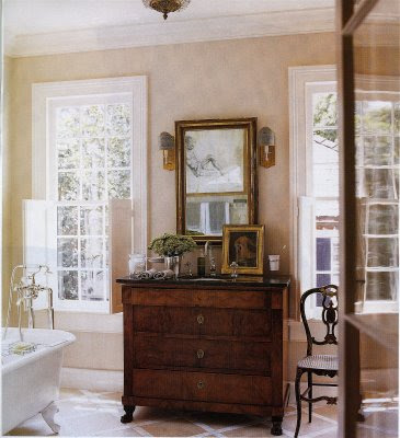
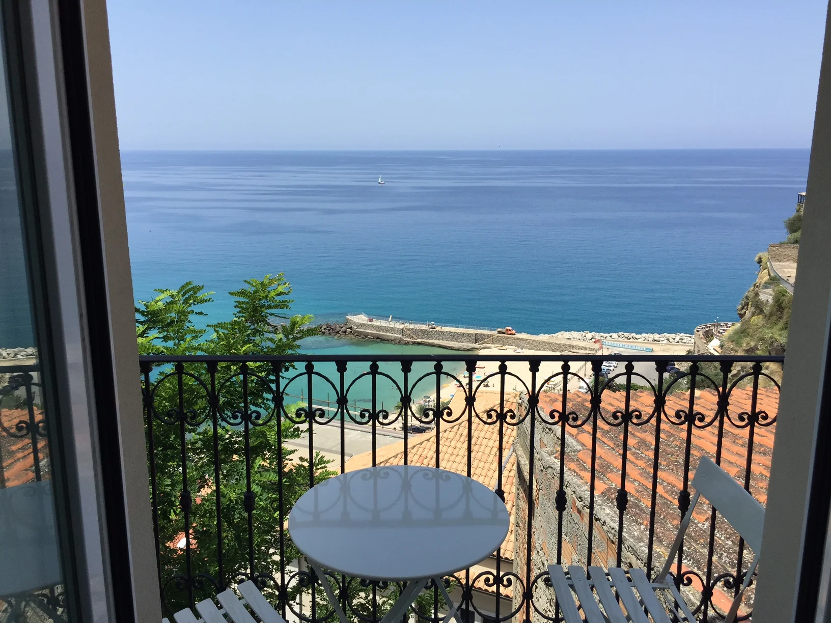
My favorite at the moment is the top left, with one window facing the sea. That would make a boudoir with sea view! We could install the sink in front of the window with a little round mirror, like in two of the pictures.

Photo source: different blogs, and flickr - Sorry I kept not track who posted it first and from which original source (internet or magazines).

Palazzo To Do: Layout and first Details

We have over thought the use of the different areas and floors and came to the following:

Seminterrato – Garden Floor:
Inside: 1 Bedroom, 1 Living Area, 1 tiny bathroom, 1 open kitchen and bar style eating area
Outside: 1 Garden (big enough for 2 sun beds and outside eating)
To check: Is tiny bathroom with shower possible in basement?
Style: ‘shabby-chic’ --> mainly leave old stone walls, ceilings and floors – combine with modern furniture
Colours: Orange, Yellow, White, Black, Mocca
Special: The Garden Floor has a separate entrance and can be used as independent apartment for guests.

Piano Terra – Ground Floor:
Inside: 1 Entrance Hall, 1 Living area, 1 Dining room, 1 open kitchen, 1 bathroom with washing machine and dryer, 1 working garage space
Outside: 1 Balcony (big enough for outside eating)
To check: can we take out separating walls between living – dining – kitchen for bigger space feeling?
Style: ‘smart casual’, ‘simple elegant’
Colours: Coral Red, White, Black, Mocca

Primo Piano – First Floor:
Inside:
Sea Side: 1 Master Bedroom, 1 Living area, 1 Master Bathroom
Piazza Side: 1 Children Room with small bathroom, 1 working or guest room, 1 separate WC
To check: can we have a shower in the small (overhanging) bathroom?
Outside: 3 small balconies to decorate with flower pots
Style: different room, different style
Colours: different room, different relaxing colour matching the blue sea and the green hills

Secondo Piano – Terrazzo – Terrace:
Inside: 1 small pantry including cooking facility and bar, 1 living area, 1 WC or small bath, 1 service area (water tank etc.)
Outside: Hugh Terrace (big enough for several sun beds, daybed, outside eating, small pool, flower pots)
To check: would floor be strong enough to carry pool?
Style: casual, simple, beach
Colours: fresh mint / cool blue, white

----
PS: the name of the blog was first "Palazzo to do" before I renamed it into "Palazzo Pizzo"